Showing data on a map is often used to help determine patterns in an organization's data. But often times, merely plotting a set of data on a map is not sufficient to extract meaning from that data. Rather, it is often just as important to symbolize data in a way that highlights key attributes or distinguishes classes of features from one another such that larger trends become apparent. For this reason, the ability to create and apply focused symbology to illustrate patterns is an essential piece of the ArcGIS Map Web Part's functionality. The Symbols tab of the Properties window provides a host of options to define effective thematic mapping for operational data. While symbol properties differ somewhat between point, line, and polygon features, the concepts behind setting symbols are the same regardless of feature geometry.
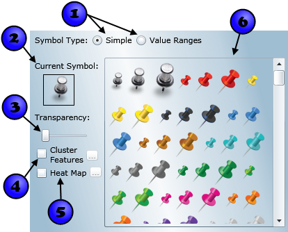
Using a simple symbol type means that all the features in a dataset will be drawn in the map using the same symbol. The Symbols tabs when configuring simple symbols for each geometry type are shown in the images below. The controls for configuring simple symbols are numbered. The use of each of these controls is described in the table below the images.
|
Point Symbols: |
Line Symbols: |
|
|
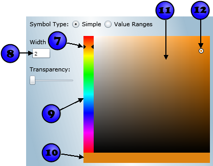
Polygon Symbols: |
|
|
|
| Number | Summary | Applies To | Description |
|---|---|---|---|
| 1 |
Symbol Type | Points, lines, and polygons | The symbol type defines whether the data will be rendered using one or multiple symbols. The default selection, simple, will render all features in the dataset using a single symbol. Selecting Value Ranges will allow you to render the dataset using multiple symbols, with each symbol assigned to a specified range of values for a particular field. |
| 2 | Current Symbol | Points | The currently selected point symbol. |
| 3 | Symbol transparency | Points, lines, and polygons | The transparency of the symbol. The left side of the slider represents opaque; the right side represents a completely transparent color. Note that, for polygon symbols, you can have different transparency values for the polygon's fill and border. Keep in mind that the maximum opacity is limited by the overall dataset transparency, which is defined on the Definition tab. |
| 4 | Clustering checkbox | Points | To cluster features, check the box. Clustering identifies groups of points in a layer that are within a given cluster distance. The cluster distance is dependent on the scale at which the map is displayed; so as you zoom in fewer points are clustered and as you zoom out, more points are clustered. By default, groups of points that form a cluster are rendered with a red circle with a white border and a number representing the number of clustered points. By clicking the ellipsis (...) button to the right of the checkbox, you can modify the colors used for the cluster symbol. When you move the mouse over a cluster in the map, the symbol will flare out to display each point as a single red circle attached to the cluster. Here is an example: 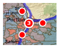 When rendering a large number of points in a map, symbolizing each point individually is often unhelpful since symbols will frequently overlap one another making it difficult to distinguish between points. Clustering is used to resolve this issue by providing a more aesthetic, efficient, and usable rendering solution. |
| 5 | Heat Map checkbox | Points | To render the points in the dataset as a heat map, check the box. With heat map symbology, points will be rendered as a gradient surface, with color assigned based on the points' geographic proximity to one another. Areas where points are densely clustered will be rendered with a high intensity color, while areas of low point density will be rendered with a low density color. An example of points rendered with heat map symbology is shown below: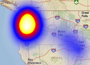 To modify the heat map's gradient, intensity, and resolution, click the ellipsis (...) button to the right of the heat map checkbox |
| 6 | Point symbol selector | Points | Contains the point symbols to choose from. To apply a symbol to the dataset, simply click on it. The change will be applied to the map data immediately. |
| 7 | Hue indicator | Lines and polygons | The two black triangles point to the hue that is currently selected on the hue selector bar. To select a new hue, you can click and drag the indicator or simply click on the hue selector bar. |
| 8 | Width textbox | Lines | Defines the width that of the line that linear datasets are symbolized with. |
| 9 | Hue selector bar | Lines and polygons | Bar that represents the available hues. To select a hue, click and drag the hue selector or click the desired hue on the bar. |
| 10 | Color indicator | Lines and polygons | Bar that shows the currently selected color |
| 11 | Saturation/value selector panel | Lines and polygons | Panel that shows the available saturations/values, as applied to the current hue. To select a new value, click the desired value in the panel or click and drag the saturation/value indicator. Since the saturation/values are shown as applied to the current hue, selecting a new hue will change the color of the panel. |
| 12 | Saturation/value indicator | Lines and polygons | The black/white circle indicates the current selected saturation/value in the saturation/value panel. You can click and drag the indicator or click anywhere within the panel to choose another color. |
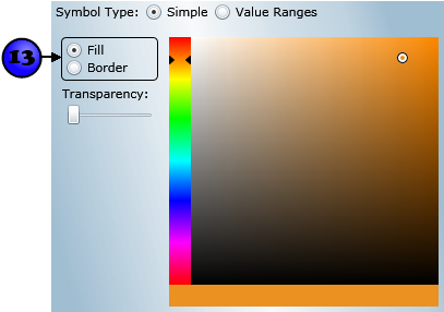
| 13 | Border/fill radio buttons | Polygons | Specifies whether the symbol is being set for the polygons' borders or fills |
Changes in the Symbols tab are displayed in the map immediately. To accept changes to the dataset, click the OK button at the bottom of the properties window. To cancel changes, click the Cancel button.
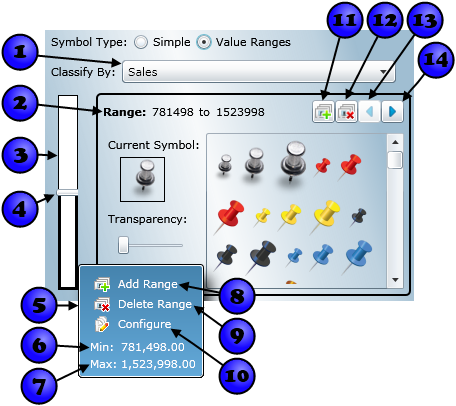
The Value Range Symbols tab provides a comprehensive interface for defining effective thematic maps. As with configuring simple symbols, the interface differs somewhat between geometry types. The value range configuration interface for each geometry type is shown in the images below. Each numbered component on the interface is described in the table below the images. Components that are shared with the simple symbol configuration interface (e.g. Current Symbol, Symbol Transparency, etc.) are described above and not repeated in this section. With components that are shared with simple symbol configuration, the difference when configuring value ranges is that settings are applied only to the value range being modified, rather than to the entire dataset.
|
Point Symbols: |
Line Symbols: |
|
|
Polygon Symbols: |
|
|
|
| Number | Summary | Applies To | Description |
|---|---|---|---|
| 1 |
Classification field | Points, lines, and polygons | The Classify By drop-down specifies which field to use to symbolize the data. You will be able to assign symbols to ranges of values for this field. |
| 2 | Current range values | Points, lines, and polygons | The minimum and maximum values of the range that is currently being edited. To change either the minimum or the maximum, simply click the value you want to change and edit it as desired. Note that you cannot change the overall minimum and maximum for the dataset. |
| 3 | Value range slider | Points, lines, and polygons | The value range slider provides a visual representation of the defined value ranges and allows you to interactively adjust those ranges. The top of the slider represents the maximum value for the selected classification field, while the bottom represents the minimum. The slider is divided by adjustable thumbs into the number of ranges you have specified (two by default). The value range currently being edited is indicated by a heavy black border around the range on the slider. The range being edited will have its values and symbology displayed to the right of the slider. To select a new range for editing, you can simply click it on the slider. For lines and polygons, the symbol of the value range is indicated by the color of the range on the slider. |
| 4 | Value range slider thumb | Points, lines, and polgyons | Value range slider thumbs represent the division between value ranges. To adjust a value range using a slider thumb, simply click and drag the thumb up or down, moving the dividing value between ranges. As you will notice, the dividing value is shown on a pop-up that opens when you hover over a thumb. |
| 5 | Value range hover menu | Points, lines, and polygons | The value range hover menu is shown whenever you move the mouse over a range in the value range slider. The hover menu provides information about ranges and functions to manipulate ranges, as described below. |
| 6 | Range menu minimum display | Points, lines, and polygons | Shows the minimum value of the range that the mouse is currently over. |
| 7 | Range menu maximum display | Points, lines, and polygons | Shows the maximum value of the range that the mouse is currently over. |
| 8 | Add range hover menu item | Points, lines, and polygons | When clicked, inserts a new value range. Has the same effect as the Add Range button. |
| 9 | Delete range hover menu item | Points, lines, and polygons | When clicked, deletes a new value range. Has the same effect as the Delete Range button. |
| 10 | Configure hover menu item | Points, lines, and polygons | When clicked, selects the range that the mouse is over for editing. Has the same effect as clicking a value range on teh slider. |
| 11 | Add Range button | Points, lines, and polygons | Adds a new value range. Has the same effect as the Add Range hover menu item. |
| 12 | Delete Range button | Points, lines, and polygons | Deletes the current range. Has the same effect as the Delete Range hover menu item. |
| 13 | Previous Range button | Points, lines, and polygons | Selects the previous range for editing. The previous range is the one with a maximum value that is the same as the current range's minimum value. |
| 14 | Next Range button | Points, lines, and polygons | Selects the next range for editing. The next range is the one with a minimum value that is the same as the current range's maximum value. |
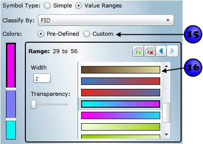
| 15 | Color scheme radio buttons | Lines and polygons | Specifies whether to apply a set of pre-defined colors to the value ranges or to specify custom colors. |
| 16 | Pre-defined color scheme selector | Lines and polygons | When using a pre-defined color scheme, select the gradient you would like to use from this list box. The gradient will be evenly distributed across the value ranges you define. |
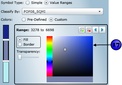
| 17 | Color selector | Lines and polygons | When using a custom color scheme (i.e. the Custom radio button is selected), you can use the color selector to define the color of the current value range. For information about how to use the color selector, refer to the previous table. |