


 Syntax
| Visual Basic (Declaration) | |
|---|---|
Public Property ItemTemplate As DataTemplate | |
| C# | |
|---|---|
public DataTemplate ItemTemplate {get; set;} | |
Example
How to use:
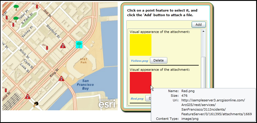
When the Map loads click on a point feature in the FeatureLayer to select the Graphic. Then use the AttachmentEditor to add, delete, and download files. Hover the mouse cursor over the attachment image to display a Microsoft ToolTip containing metadata about the attachment.
The XAML code in this example is used in conjunction with the code-behind (C# or VB.NET) to demonstrate the functionality.
The following screen shot corresponds to the code example in this page.
| XAML |  Copy Code Copy Code |
|---|---|
<Grid x:Name="LayoutRoot"> <!-- The Grid.Resources section is a great place to define a DataTemplate used by the AttachmentEditor Control. The x:Key is needed to reference the DataTemplate in the AttachmentEditor.ItemTemplate Property. SPECIAL NOTE: The binding that occurs to the UI Elements in the DataTemplate use Properties from the ESRI.ArcGIS.Client.FeatureService.AttachmentInfo Class (additional comments will be added to point out which Properties are used). --> <Grid.Resources> <!-- Define a simple StaticResource that will be displayed as a visual UI Element of the ListBox portion of the AttachmentEditor. This will help illustrate one way to perform Binding. You will need to add the following XML namespace to use 'sys' variables: xmlns:sys="clr-namespace:System;assembly=mscorlib" --> <sys:String x:Key="SingleString">Visual appearance of the attachment:</sys:String> <!-- Define a DataTemplate and use the x:Key to reference it in other parts of XAML. --> <DataTemplate x:Key="AEItemTemplate"> <Grid Margin="3"> <StackPanel> <!-- Create a TextBlock that informs the user they are seeing a visual depiction of the attachment associated with the Graphic in the FeatureLayer. Note how the Binding.Source Property needs to be set in order to use a custom object. This syntax is quite different from the other Bindings that occur in which it is automatically implied in the Binding that we are accessing a Property of the FeatureService.AttachmentInfo Class. --> <TextBlock Margin="0,0" Text="{Binding Source={StaticResource SingleString}}" /> <StackPanel Orientation="Horizontal"> <!-- Attachments that are images will be displayed in the ListBox of the AttachmentEditor. Note: The Image.Source Property use Binding to the AttachmentInfo.Uri Property. --> <Image Source="{Binding Uri}" MaxWidth="75" MaxHeight="75" Stretch="Uniform"> <!-- A Microsoft ToolTip Control will be used such that when the user hovers the Mouse Cursor over the image, additional metadata information from the AttachmentInfo Class associated internally with the AttachmentEditor will be displayed. --> <ToolTipService.ToolTip> <Grid> <Grid.RowDefinitions> <RowDefinition Height="Auto" /> <RowDefinition Height="Auto" /> <RowDefinition Height="Auto" /> <RowDefinition Height="Auto" /> </Grid.RowDefinitions> <Grid.ColumnDefinitions> <ColumnDefinition Width="Auto" /> <ColumnDefinition Width="Auto" /> </Grid.ColumnDefinitions> <!-- Note: The TextBlock.Text Property use Binding to the AttachmentInfo.Name Property to enhance the metadata information about the image attachment displayed in the ToolTip. --> <TextBlock Text="Name: " Margin="10,0,0,0" HorizontalAlignment="Right" VerticalAlignment="Center" Grid.Row="0" Grid.Column="0" /> <TextBlock Text="{Binding Name}" Margin="5,0" MaxWidth="250" TextWrapping="Wrap" Grid.Row="0" Grid.Column="1" VerticalAlignment="Center" /> <!-- Note: The TextBlock.Text Property use Binding to the AttachmentInfo.Size Property to enhance the metadata information about the image attachment displayed in the ToolTip. --> <TextBlock Text="Size: " Margin="10,0,0,0" HorizontalAlignment="Right" Grid.Row="1" Grid.Column="0" /> <TextBlock Text="{Binding Size}" Margin="5,0" MaxWidth="250" TextWrapping="Wrap" Grid.Row="1" Grid.Column="1" /> <!-- Note: The TextBlock.Text Property use Binding to the AttachmentInfo.Uri Property to enhance the metadata information about the image attachment displayed in the ToolTip. --> <TextBlock Text="Uri: " Margin="10,0,0,0" HorizontalAlignment="Right" Grid.Row="2" Grid.Column="0" /> <TextBlock Text="{Binding Uri}" Margin="5,0" MaxWidth="250" TextWrapping="Wrap" Grid.Row="2" Grid.Column="1" /> <!-- Note: The TextBlock.Text Property use Binding to the AttachmentInfo.ContentType Property to enhance the metadata information about the image attachment displayed in the ToolTip. --> <TextBlock Text="Content Type: " Margin="10,0,0,0" HorizontalAlignment="Right" Grid.Row="3" Grid.Column="0" /> <TextBlock Text="{Binding ContentType}" Margin="5,0" MaxWidth="250" TextWrapping="Wrap" Grid.Row="3" Grid.Column="1" /> </Grid> </ToolTipService.ToolTip> </Image> </StackPanel> <StackPanel Orientation="Horizontal"> <!-- Display the filename of the image attachment just below the picture of the image in the ListBox of the AttachmentEditor. Note: The Hyperlink.Content uses Binding to the AttachmentInfo.Name Property and the Hyperlink.NavigateUri uses Binding to the AttachmentInfo.Uri Property. --> <HyperlinkButton Content="{Binding Name}" NavigateUri="{Binding Uri}" TargetName="_blank" HorizontalAlignment="Center" VerticalAlignment="Center" Margin="0,3,0,0" FontFamily="Arial Black" FontSize="10" FontStyle="Italic" /> <!-- Provide the ability to Delete an image attachment from the AttachmentEditor and the FeatureLayer FeatureServer. It is the Button.Command Property that will have Binding to the AttachmentInfo.Delete Property (which is a Type of ICommand). --> <Button Content="Delete" Command="{Binding Delete}" Width="60" Margin="5,5,5,5" HorizontalAlignment="Center" VerticalAlignment="Center"/> </StackPanel> <Border BorderThickness="1" BorderBrush="Black"></Border> </StackPanel> </Grid> </DataTemplate> </Grid.Resources> <!-- Provide the instructions on how to use the sample code. --> <TextBlock Height="64" HorizontalAlignment="Left" Name="TextBlock1" VerticalAlignment="Top" Width="512" TextWrapping="Wrap" Margin="12,12,0,0" Text="When the Map loads click on a point feature in the FeatureLayer to select the Graphic. Then use the AttachmentEditor to add, delete, and download files. Hover the mouse cursor over the attachment image to display a Microsoft ToolTip containing metadata about the attachment." /> <!-- Add a Map control with an ArcGISTiledMapeServiceLayer and a FeatureLayer. It is important to provide a Name for the Map Control as this will be used by the AttachmentEditor Control. Define and initial Extent for the map. --> <esri:Map Background="White" HorizontalAlignment="Left" Margin="12,100,0,0" Name="MyMap" VerticalAlignment="Top" Height="375" Width="400" Extent="-13625087,4547888,-13623976,4548643"> <!-- Add a backdrop ArcGISTiledMapServiceLayer. --> <esri:ArcGISTiledMapServiceLayer Url="http://services.arcgisonline.com/ArcGIS/rest/services/World_Street_Map/MapServer" /> <!-- The FeatureLayer is based upon an ArcGIS Server 'FeatureServer' service not a 'MapServer' service. It is important to provide an ID value as this will be used for Binding in the AttachementEditor. The MouseLeftButtonUp Event handler has been defined for the FeatureLayer. --> <esri:FeatureLayer ID="IncidentsLayer" Url="http://sampleserver3.arcgisonline.com/ArcGIS/rest/services/SanFrancisco/311Incidents/FeatureServer/0" MouseLeftButtonUp="FeatureLayer_MouseLeftButtonUp" AutoSave="False" DisableClientCaching="True" OutFields="*" Mode="OnDemand" /> </esri:Map> <!-- Wrap the Attachment Editor inside of a Grid and other controls to provide a stylistic look and to provide instructions to the user. --> <Grid HorizontalAlignment="Left" VerticalAlignment="Top" Margin="450,100,15,0" > <Rectangle Fill="BurlyWood" Stroke="Green" RadiusX="15" RadiusY="15" Margin="0,0,0,5" > <Rectangle.Effect> <DropShadowEffect/> </Rectangle.Effect> </Rectangle> <Rectangle Fill="#FFFFFFFF" Stroke="Aqua" RadiusX="5" RadiusY="5" Margin="10,10,10,15" /> <StackPanel Orientation="Vertical" HorizontalAlignment="Left"> <TextBlock Text="Click on a point feature to select it, and click the 'Add' button to attach a file." Width="275" TextAlignment="Left" Margin="20,20,20,5" TextWrapping="Wrap" FontWeight="Bold"/> <!-- Add an AttachmentEditor. Provide a x:Name for the AttachmentEditor so that it can be used in the code-behind file. The FeatureLayer Property is bound to the 'IncidentLayer' of the Map Control. Only one group of Filter types are used (you can have multiple file extensions in a group) to drive the OpenFileDialog. This AttachmentEditor will only allow the uploading of Image files. This is necessary because as part of the DataTemplate that will control the appearance and core behavior, the actual images will be displayed. The FilterIndex shows the first group of Filter Types in the OpenFileDialog dropdown list. Only allow the user to upload (i.e. Add) one file at a time using the OpenFileDialog with the Multiselect set to False. An UploadFailed Event has been defined for the code-behind. The appearance and core behavior of the ListBox sub-component of the AttachmentEditor is controlled by defining a DataTemplate (see above) and using it for the ItemTemplate Property. SPECIAL NOTE: The binding that occurs to the UI Elements in the DataTemplate use Properties from the ESRI.ArcGIS.Client.FeatureService.AttachmentInfo Class. --> <esri:AttachmentEditor x:Name="MyAttachmentEditor" VerticalAlignment="Top" Margin="20,5,20,20" Background="LightGoldenrodYellow" Width="280" Height="300" HorizontalAlignment="Right" FeatureLayer="{Binding Layers[IncidentsLayer], ElementName=MyMap}" Filter="Image Files|*.jpg;*.gif;*.png;*.bmp" FilterIndex="1" Multiselect="False" UploadFailed="MyAttachmentEditor_UploadFailed" ItemTemplate="{StaticResource AEItemTemplate}"> </esri:AttachmentEditor> </StackPanel> </Grid> </Grid> | |
| C# | Copy Code |
|---|---|
private void FeatureLayer_MouseLeftButtonUp(object sender, ESRI.ArcGIS.Client.GraphicMouseButtonEventArgs e) { // This function obtains the FeatureLayer, loops through all of the Graphic features and // un-selects them. Then for the Graphic for which the user clicked with the mouse select // it and use that Graphic to set the AttachmentEditor.GraphicSource to enable uploading, // downloading, and deleting attachment files on the ArcGIS Server backend database. // Get the FeatureLayer from the sender object of the FeatureLayer.MouseLeftButtonUp Event. ESRI.ArcGIS.Client.FeatureLayer myFeatureLayer = sender as ESRI.ArcGIS.Client.FeatureLayer; // Loop through all of the Graphics in the FeatureLayer and UnSelect them. for (int i = 0; i < myFeatureLayer.SelectionCount; i++) { myFeatureLayer.SelectedGraphics.ToList()[i].UnSelect(); } // Select the Graphic from the e object which will change visibly on the Map via highlighting. e.Graphic.Select(); // Setting the AttachmentEditor.GraphicSource immediately causes the AttachmentEditor Control // to update with any attachments currently associated with the Graphic. MyAttachmentEditor.GraphicSource = e.Graphic; } private void MyAttachmentEditor_UploadFailed(object sender, ESRI.ArcGIS.Client.Toolkit.AttachmentEditor.UploadFailedEventArgs e) { // Display any error messages that may occur if the AttachmentEditor fails to upload a file. MessageBox.Show(e.Result.Message); } | |
| VB.NET | Copy Code |
|---|---|
Private Sub FeatureLayer_MouseLeftButtonUp(ByVal sender As Object, ByVal e As ESRI.ArcGIS.Client.GraphicMouseButtonEventArgs) ' This function obtains the FeatureLayer, loops through all of the Graphic features and ' un-selects them. Then for the Graphic for which the user clicked with the mouse select ' it and use that Graphic to set the AttachmentEditor.GraphicSource to enable uploading, ' downloading, and deleting attachment files on the ArcGIS Server backend database. ' Get the FeatureLayer from the sender object of the FeatureLayer.MouseLeftButtonUp Event. Dim myFeatureLayer As ESRI.ArcGIS.Client.FeatureLayer = TryCast(sender, ESRI.ArcGIS.Client.FeatureLayer) ' Loop through all of the Graphics in the FeatureLayer and UnSelect them. For i As Integer = 0 To myFeatureLayer.SelectionCount - 1 myFeatureLayer.SelectedGraphics.ToList()(i).UnSelect() Next i ' Select the Graphic from the e object which will change visibly on the Map via highlighting. e.Graphic.Select() ' Setting the AttachmentEditor.GraphicSource immediately causes the AttachmentEditor Control ' to update with any attachments currently associated with the Graphic. MyAttachmentEditor.GraphicSource = e.Graphic End Sub Private Sub MyAttachmentEditor_UploadFailed(ByVal sender As Object, ByVal e As ESRI.ArcGIS.Client.Toolkit.AttachmentEditor.UploadFailedEventArgs) ' Display any error messages that may occur if the AttachmentEditor fails to upload a file. MessageBox.Show(e.Result.Message) End Sub | |
Remarks
Changing the core default behavior and appearance of the ListBox sub-component of the AttachmentEditor Control can be modified using a DataTemplate via the AttachmentEditor.ItemTemplate Property and writing your own custom code when necessary. When defining the DataTemplate, the Binding Properties that developers usually want to use to control the behavior of the ListBox sub-component of the AttachmentEditor are based upon those in the ESRI.ArcGIS.Client.FeatureService.AttachmentInfo Class.
If only the superficial appearance of the AttachmentEditor Control is desired to be modified (i.e. Height, Width, Background, FontSize, etc.) consider using the numerous inherited Properties from System.Windows.FrameworkElement, System.Windows.UIElement, and System.Windows.Controls.
Note: you cannot change the core behavior of the sub-components (i.e. Button, ListBox, etc.) of the AttachmentEditor Control using standard Properties or Methods alone. To change the core behavior of the sub-components and their appearance of the Control, developers can modify the Control Template in XAML and the associated code-behind file. The easiest way to modify the UI sub-components is using Microsoft Expression Blend. Then developers can delete/modify existing or add new sub-components in Visual Studio to create a truly customized experience. A general approach to customizing a Control Template is discussed in the ESRI blog entitled: Use control templates to customize the look and feel of ArcGIS controls.
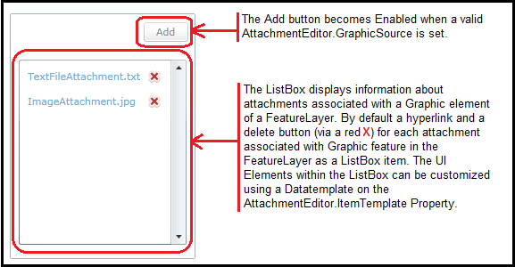
The AttachmentEditor is essentially made of two core parts: an Add button and a ListBox that displays information about attachments associated with a Graphic element of a FeatureLayer. The attachments are stored in the backend database of a FeatureLayer on an ArcGIS Server FeatureServer. The default AttachmentEditor will display a hyperlink and a delete button (via a red X) for each attachment associated with Graphic feature in the FeatureLayer as a ListBox item. See the following screen shot that depicts the two core parts of the AttachmentEditor Control.
The power of using a DataTemplate via XAML to control the behavior and appearance the ListBox sub-component of the AttachmentEditor is great but comes at the price of understanding the complexity of Binding and having an artistic flair to make a nice UI design. Developers can control the contents of the ListBox sub-component UI Element via a Datatemplate of the AttachmentEditor using the AttachmentEditor.ItemTempalte Property. Developers cannot control the Add button of the AttachmentEditor using a DataTemplate. In most circumstances the ListBox sub-component UI Element that is customized in the DataTemplate will have Binding to the AttachmentEditors internal usage of the ESRI.ArcGIS.Client.FeatureService.AttachmentInfo Class Properties. There are six AttachmentInfo Properties:
The Binding syntax for the ListBox sub-component UI Element of the AttachmentEditor typically follows the pattern of: "{Binding <PropertyName>}"
Where <PropertyName> is the name of a FeatureService.AttachmentInfo Property (ex: Name or Uri). Note when no source is specified for the Binding, it is implicitly implied that it is the FeatureService.AttachmentInfo Class. If developers desire to use Data Binding to other objects they will be responsible for specifying the correct binding source. The code example in this document provides an example of Binding the ListBox sub-component UI Element of the AttachmentEditor to both FeatureService.AttachmentInfo Properties and user defined static sources.
The FeatureService.AttachmentInfo.Delete Property is a unique in that it is not a simple data Type (or does not easily translate to a simple data Type via an internal converter). The FeatureService.AttachmentInfo.Delete Property returns a System.Windows.Input.ICommand Object. The trick to Binding to this Property is to Bind it to the ButtonBase.Command Property of the various UI Elements (ex: Button, HyperlinkButton, RepeatButton, ToggleButton, etc) to the desired UI Element. The code example in this document demonstrates Binding a simple Button’s Command Property to the FeatureService.AttachmentInfo.Delete Property to delete attachments from the AttachmentEditor and the FeatureLayers FeatureService backend database.
Requirements
Target Platforms: Windows XP Professional, Windows Server 2003 family, Windows Vista, Windows Server 2008 family